In this post we will learn how to build a number picker in Flutter.
We will create a NumberPicker stateful widget that will allow the user to select a number from a range of numbers.
Table of contents
Open Table of contents
- Desired Outcome
- Prerequisites
- Show range of odd number horizontally
- Add onTap logic to select a number
- Add increment and decrement buttons to adjust selected number
- Add visual widgets for even numbers
- Add animation for horizontal scroll on number select event
- Add colors gradient from red to green
- Conclusion
Desired Outcome
User should be able to select a number from a range of odd numbers.
User should be able to adjust selected number by tapping on the increment and decrement buttons.
Prerequisites
Install Flutter and Dart on your machine. Create a new Flutter project.
Create a new dart file number_picker.dart in the lib directory.
In this file add a simple boilerplate for a stateful widget.
import 'package:flutter/material.dart';
class NumberPicker extends StatefulWidget {  const NumberPicker({super.key});
  @override  State<NumberPicker> createState() {    return _NumberPickerState();  }}
class _NumberPickerState extends State<NumberPicker> {  @override  Widget build(BuildContext context) {    return Scaffold(      appBar: AppBar(        title: const Text('Select a Number'),      ),      body: const Text('Happy Face :)'),    );  }}
And update main.dart to use the NumberPicker widget.
import 'package:flutter/material.dart';import 'package:example/number_picker.dart';
void main() async {  WidgetsFlutterBinding.ensureInitialized();
  runApp(const MyApp());}
class MyApp extends StatelessWidget {  const MyApp({super.key});
  @override  Widget build(BuildContext context) {    return MaterialApp(      home: const NumberPicker(),    );  }}
Now we are set for success :)
Show range of odd number horizontally
Idea for my NumberPicker widget is to show a range of odd numbers horizontally and let user scroll it to select a number.
To achieve that we will use SingleChildScrollView with Row widget.
We will generate a list of numbers using List.generate and add them to the parent Row widget.
In this step we will focus on implementing code for body of the Scaffold widget in the NumberPicker widget.
Follow inline comments to understand the code.
17 collapsed lines
import 'package:flutter/material.dart';
class NumberPicker extends StatefulWidget { const NumberPicker({super.key});
@override State<NumberPicker> createState() { return _NumberPickerState(); }}
class _NumberPickerState extends State<NumberPicker> { @override Widget build(BuildContext context) { return Scaffold( appBar: AppBar( title: const Text('Select a Number'), ),
body: Column( children: [ SingleChildScrollView( scrollDirection: Axis.horizontal, child: Row(
children: List.generate(
19, (index) {
if (index % 2 == 1) { return const SizedBox( width: 6.0, height: 25.0, ); }
return GestureDetector( onTap: () {},
child: Container( margin: const EdgeInsets.all(10.0), width: 50.0, height: 50.0, alignment: Alignment.center, decoration: BoxDecoration( color: Colors.lightBlueAccent, borderRadius: BorderRadius.circular(10.0), ), child: Text( '${index + 1}', style: const TextStyle( color: Colors.white, fontSize: 20.0, ), ), ),10 collapsed lines
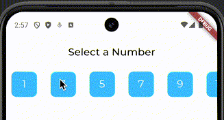
); }, ), ), ) ], ), ); }}Try to run your app and see if you can see a range of odd numbers showed horizontally, where numbers are white on blue background.
Add onTap logic to select a number
Now we will add onTap logic to the GestureDetector widget.
When user taps on a number we will change the background color of the selected number to green.
12 collapsed lines
import 'package:flutter/material.dart';
class NumberPicker extends StatefulWidget { const NumberPicker({super.key});
@override State<NumberPicker> createState() { return _NumberPickerState(); }}
class _NumberPickerState extends State<NumberPicker> {
int selectedNumber = 1;
@override Widget build(BuildContext context) {19 collapsed lines
return Scaffold( appBar: AppBar( title: const Text('Select a Number'), ), body: Column( children: [ SingleChildScrollView( scrollDirection: Axis.horizontal, child: Row( children: List.generate( 19, (index) { if (index % 2 == 1) { return const SizedBox( width: 6.0, height: 25.0, ); } return GestureDetector( onTap: () {
setState(() {
selectedNumber = index + 1; }); }, child: Container( margin: const EdgeInsets.all(10.0), width: 50.0, height: 50.0, alignment: Alignment.center, decoration: BoxDecoration(
color: selectedNumber == index + 1 ? Colors.lightBlueAccent : Colors.green, borderRadius: BorderRadius.circular(10.0), ),18 collapsed lines
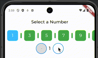
child: Text( '${index + 1}', style: const TextStyle( color: Colors.white, fontSize: 20.0, ), ), ), ); }, ), ), ) ], ), ); }}Let’s run the app and see if we can select a number by tapping on it and if it changes its color to green.
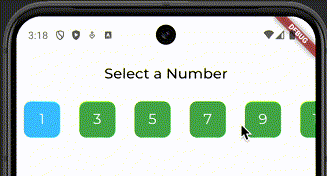
Note: I guess you noticed, I messed with colors, and switched them. So Blue is selected number and Green is not selected.
Add increment and decrement buttons to adjust selected number
In this step we will add 3 new visual elements to our widget:
- Decrement button
- Text widget to show selected number
- Increment button
I used a lazy way to create buttons, do not use it in production code.
Follow inline comments to understand the code.
64 collapsed lines
import 'package:flutter/material.dart';
class NumberPicker extends StatefulWidget { const NumberPicker({super.key});
@override State<NumberPicker> createState() { return _NumberPickerState(); }}
class _NumberPickerState extends State<NumberPicker> { int selectedNumber = 1;
@override Widget build(BuildContext context) { return Scaffold( appBar: AppBar( title: const Text('Select a Number'), ), body: Column( children: [ SingleChildScrollView( scrollDirection: Axis.horizontal, child: Row( children: List.generate( 19, (index) { if (index % 2 == 1) { return const SizedBox( width: 6.0, height: 25.0, ); } return GestureDetector( onTap: () { setState(() { selectedNumber = index + 1; }); }, child: Container( margin: const EdgeInsets.all(10.0), width: 50.0, height: 50.0, alignment: Alignment.center, decoration: BoxDecoration( color: selectedNumber == index + 1 ? Colors.lightBlueAccent : Colors.green, borderRadius: BorderRadius.circular(10.0), ), child: Text( '${index + 1}', style: const TextStyle( color: Colors.white, fontSize: 20.0, ), ), ), ); }, ), ), ),
Row( mainAxisAlignment: MainAxisAlignment.center, children: [ SizedBox( height: 50, width: 50, child: OutlinedButton(
onPressed: selectedNumber == 1 ? null : () { setState(() { if (selectedNumber > 1) { selectedNumber--; } }); },
style: OutlinedButton.styleFrom( backgroundColor:
selectedNumber == 1 ? Colors.grey[300] : Colors.white, side: const BorderSide(color: Colors.blue, width: 2), alignment: Alignment.center, ), child: const Text('-'), ), ),
Container( margin: const EdgeInsets.all(10.0), child: Text( '$selectedNumber', style: const TextStyle( fontSize: 20.0, fontWeight: FontWeight.bold, ), ), ), SizedBox( height: 50, width: 50,
child: OutlinedButton( onPressed: selectedNumber == 19 ? null : () { setState(() { if (selectedNumber < 19) { selectedNumber++; } }); }, style: OutlinedButton.styleFrom( backgroundColor: selectedNumber == 19 ? Colors.grey[300] : Colors.white, side: const BorderSide(color: Colors.blue, width: 2), alignment: Alignment.center, ), child: const Text('+'), ),8 collapsed lines
), ], ), ], ), ); }}Save your changes and refresh the app to see the new UI.
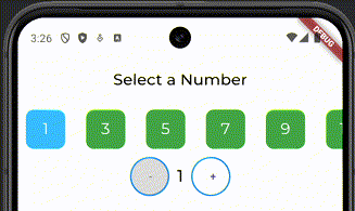
As you can see now we have horizontal range of odd numbers, user can select a number by tapping on it and adjust it by using increment and decrement buttons.
Next two steps are optional, and you can implement them if you want to have some fun.
Add visual widgets for even numbers
I would like to add instead of SizedBox widget for even numbers a visual representation of even numbers.
User won’t be able to tap on them, but they will be able to see them.
Also, these widgets will change color based on selected number.
28 collapsed lines
import 'package:flutter/material.dart';
class NumberPicker extends StatefulWidget { const NumberPicker({super.key});
@override State<NumberPicker> createState() { return _NumberPickerState(); }}
class _NumberPickerState extends State<NumberPicker> { int selectedNumber = 1;
@override Widget build(BuildContext context) { return Scaffold( appBar: AppBar( title: const Text('Select a Number'), ), body: Column( children: [ SingleChildScrollView( scrollDirection: Axis.horizontal, child: Row( children: List.generate( 19, (index) {
if (index % 2 == 1) { return Container( margin: const EdgeInsets.symmetric(horizontal: 1.0), width: 6.0, height: 25.0, decoration: BoxDecoration( color: selectedNumber == index + 1 ? Colors.lightBlueAccent : Colors.green, shape: BoxShape.rectangle, borderRadius: BorderRadius.circular(5.0), ), ); }94 collapsed lines
return GestureDetector( onTap: () { setState(() { selectedNumber = index + 1; }); }, child: Container( margin: const EdgeInsets.all(10.0), width: 50.0, height: 50.0, alignment: Alignment.center, decoration: BoxDecoration( color: selectedNumber == index + 1 ? Colors.lightBlueAccent : Colors.green, borderRadius: BorderRadius.circular(10.0), ), child: Text( '${index + 1}', style: const TextStyle( color: Colors.white, fontSize: 20.0, ), ), ), ); }, ), ), ), Row( mainAxisAlignment: MainAxisAlignment.center, children: [ SizedBox( height: 50, width: 50, child: OutlinedButton( onPressed: selectedNumber == 1 ? null : () { setState(() { if (selectedNumber > 1) { selectedNumber--; } }); }, style: OutlinedButton.styleFrom( backgroundColor: selectedNumber == 1 ? Colors.grey[300] : Colors.white, side: const BorderSide(color: Colors.blue, width: 2), alignment: Alignment.center, ), child: const Text('-'), ), ), Container( margin: const EdgeInsets.all(10.0), child: Text( '$selectedNumber', style: const TextStyle( fontSize: 20.0, fontWeight: FontWeight.bold, ), ), ), SizedBox( height: 50, width: 50, child: OutlinedButton( onPressed: selectedNumber == 19 ? null : () { setState(() { if (selectedNumber < 19) { selectedNumber++; } }); }, style: OutlinedButton.styleFrom( backgroundColor: selectedNumber == 19 ? Colors.grey[300] : Colors.white, side: const BorderSide(color: Colors.blue, width: 2), alignment: Alignment.center, ), child: const Text('+'), ), ), ], ), ], ), ); }}Save, refresh, test :)
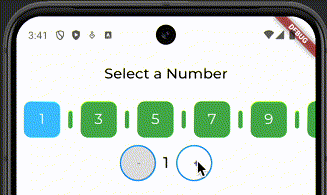
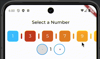
As you can see, when you change number by clicking Increment/Decrement buttons, even numbers change their color based on selected number.
My goal was to decrease confusion of end user, so they can quickly select number see which number is selected.
Add animation for horizontal scroll on number select event
In this step we will add a simple animation to scroll to the selected number when user taps on it, or changes it by using Increment/Decrement buttons.
For this we will use ScrollController and animateTo method.
One custom logic is added to calculate the offset based on the selected number. This offset includes size of the odd number widget plus even number widget to correctly translate position of horizontal scroll and show selected number on the screen.
10 collapsed lines
import 'package:flutter/material.dart';
class NumberPicker extends StatefulWidget { const NumberPicker({super.key});
@override State<NumberPicker> createState() { return _NumberPickerState(); }}
class _NumberPickerState extends State<NumberPicker> { int selectedNumber = 1;
ScrollController scrollController = ScrollController();
@override Widget build(BuildContext context) { return Scaffold(5 collapsed lines
appBar: AppBar( title: const Text('Select a Number'), ), body: Column( children: [ SingleChildScrollView( scrollDirection: Axis.horizontal,
controller: scrollController, child: Row( children: List.generate(16 collapsed lines
19, (index) { if (index % 2 == 1) { return Container( margin: const EdgeInsets.symmetric(horizontal: 1.0), width: 6.0, height: 25.0, decoration: BoxDecoration( color: selectedNumber == index + 1 ? Colors.lightBlueAccent : Colors.green, shape: BoxShape.rectangle, borderRadius: BorderRadius.circular(5.0), ), ); } return GestureDetector( onTap: () { setState(() { selectedNumber = index + 1; });
double offset = 0; for (int i = 1; i < selectedNumber; i++) { offset += (i % 2 == 0) ? 8 : 60; // 8 is the width of the circle plus margins, 60 is the width of the item plus margins }
scrollController.animateTo( offset, duration: const Duration(milliseconds: 500), curve: Curves.linear, ); }, child: Container(23 collapsed lines
margin: const EdgeInsets.all(10.0), width: 50.0, height: 50.0, alignment: Alignment.center, decoration: BoxDecoration( color: selectedNumber == index + 1 ? Colors.lightBlueAccent : Colors.green, borderRadius: BorderRadius.circular(10.0), ), child: Text( '${index + 1}', style: const TextStyle( color: Colors.white, fontSize: 20.0, ), ), ), ); }, ), ), ), Row( mainAxisAlignment: MainAxisAlignment.center, children: [ SizedBox( height: 50, width: 50, child: OutlinedButton( onPressed: selectedNumber == 1 ? null : () { setState(() { if (selectedNumber > 1) { selectedNumber--; } });
double offset = 0; for (int i = 1; i < selectedNumber; i++) { offset += (i % 2 == 0) ? 8 : 60; // 8 is the width of the circle plus margins, 60 is the width of the item plus margins }
scrollController.animateTo( offset, duration: const Duration(milliseconds: 500), curve: Curves.linear, ); }, style: OutlinedButton.styleFrom(21 collapsed lines
backgroundColor: selectedNumber == 1 ? Colors.grey[300] : Colors.white, side: const BorderSide(color: Colors.blue, width: 2), alignment: Alignment.center, ), child: const Text('-'), ), ), Container( margin: const EdgeInsets.all(10.0), child: Text( '$selectedNumber', style: const TextStyle( fontSize: 20.0, fontWeight: FontWeight.bold, ), ), ), SizedBox( height: 50, width: 50, child: OutlinedButton( onPressed: selectedNumber == 19 ? null : () { setState(() { if (selectedNumber < 19) { selectedNumber++; } });
double offset = 0; for (int i = 1; i < selectedNumber; i++) { offset += (i % 2 == 0) ? 8 : 60; // 8 is the width of the circle plus margins, 60 is the width of the item plus margins }
scrollController.animateTo( offset, duration: const Duration(milliseconds: 500), curve: Curves.linear, ); }, style: OutlinedButton.styleFrom(15 collapsed lines
backgroundColor: selectedNumber == 19 ? Colors.grey[300] : Colors.white, side: const BorderSide(color: Colors.blue, width: 2), alignment: Alignment.center, ), child: const Text('+'), ), ), ], ), ], ), ); }}After saving these changes you should be able to see the animation when you tap on a number or use Increment/Decrement buttons.
Note: This is a simple animation, you can improve it by adding more complex animations. And implement it in a more efficient way.
Add colors gradient from red to green
In this final section, I will show you how to add a gradient color to each number (odd/even) widget.
My idea is to use red-ish color for small numbers and with each number increase to change color to green.
The higher number the better.
To create a gradient color we will use Color.lerp, not the best, can create some ugly blending colors, but it’s fast.
16 collapsed lines
import 'package:flutter/material.dart';
class NumberPicker extends StatefulWidget { const NumberPicker({super.key});
@override State<NumberPicker> createState() { return _NumberPickerState(); }}
class _NumberPickerState extends State<NumberPicker> { int selectedNumber = 11; ScrollController scrollController = ScrollController();
@override Widget build(BuildContext context) {
Color? startColor = Colors.red[900]; // Dark red Color? midColor = Colors.yellow[700]; // Light yellow Color? endColor = Colors.green[900]; // Dark green
return Scaffold(9 collapsed lines
appBar: AppBar( title: const Text('Select a Number'), ), body: Column( children: [ SingleChildScrollView( controller: scrollController, scrollDirection: Axis.horizontal, child: Row( children: List.generate( 19, (index) {
Color? boxColor; if (index < 10) { boxColor = Color.lerp(startColor, midColor, index / 9); } else { boxColor = Color.lerp(midColor, endColor, (index - 10) / 9); }
if (index % 2 == 1) { return Container( margin: const EdgeInsets.symmetric(horizontal: 1.0), width: 6.0, height: 25.0, decoration: BoxDecoration( color: selectedNumber == index + 1 ? Colors.lightBlueAccent
: boxColor, shape: BoxShape.rectangle,24 collapsed lines
borderRadius: BorderRadius.circular(5.0), ), ); }
return GestureDetector( onTap: () { setState(() { selectedNumber = index + 1; });
double offset = 0; for (int i = 1; i < selectedNumber; i++) { offset += (i % 2 == 0) ? 8 : 60; // 8 is the width of the circle plus margins, 60 is the width of the item plus margins }
scrollController.animateTo( offset, duration: const Duration(milliseconds: 500), curve: Curves.linear, ); }, child: Container( margin: const EdgeInsets.all(10.0), width: 50.0, height: 50.0, alignment: Alignment.center, decoration: BoxDecoration( color: selectedNumber == index + 1 ? Colors.lightBlueAccent
: boxColor, borderRadius: BorderRadius.circular(10.0), ),103 collapsed lines
child: Text( '${index + 1}', style: const TextStyle( color: Colors.white, fontSize: 20.0, ), ), ), ); }, ), ), ), Row( mainAxisAlignment: MainAxisAlignment.center, children: [ SizedBox( height: 50, width: 50, child: OutlinedButton( onPressed: selectedNumber == 1 ? null : () { setState(() { if (selectedNumber > 1) { selectedNumber--; } });
double offset = 0; for (int i = 1; i < selectedNumber; i++) { offset += (i % 2 == 0) ? 8 : 60; // 8 is the width of the circle plus margins, 60 is the width of the item plus margins }
scrollController.animateTo( offset, duration: const Duration(milliseconds: 500), curve: Curves.linear, ); }, style: OutlinedButton.styleFrom( backgroundColor: selectedNumber == 1 ? Colors.grey[300] : Colors.white, side: const BorderSide(color: Colors.blue, width: 2), alignment: Alignment.center, ), child: const Text('-'), ), ), Container( margin: const EdgeInsets.all(10.0), child: Text( '$selectedNumber', style: const TextStyle( fontSize: 20.0, fontWeight: FontWeight.bold, ), ), ), SizedBox( height: 50, width: 50, child: OutlinedButton( onPressed: selectedNumber == 19 ? null : () { setState(() { if (selectedNumber < 19) { selectedNumber++; } });
double offset = 0; for (int i = 1; i < selectedNumber; i++) { offset += (i % 2 == 0) ? 8 : 60; // 8 is the width of the circle plus margins, 60 is the width of the item plus margins }
scrollController.animateTo( offset, duration: const Duration(milliseconds: 500), curve: Curves.linear, ); }, style: OutlinedButton.styleFrom( backgroundColor: selectedNumber == 19 ? Colors.grey[300] : Colors.white, side: const BorderSide(color: Colors.blue, width: 2), alignment: Alignment.center, ), child: const Text('+'), ), ), ], ), ], ), ); }}Now let’s save your changes and refresh the app to see the final result.
Note: Try to change this approach, and instead of making background of different color, change the border color of the number widget.
Conclusion
In this post we learned how to build a number picker in Flutter without using any external packages.
We started with a simple case of showing a range of odd numbers horizontally, then added onTap logic to select a number, and increment/decrement buttons to adjust the selected number.
We added visual representation of even numbers, and animated horizontal scroll to selected number.
Finally, we added a gradient color from red to green for each number widget.
Code is not perfect, and can be improved in many ways, but it’s a good starting point for building your own number picker widget.
Thank you for reading, and I hope you learned something new today 🧁